KOWLOON WALLED CITY
KOWLOON WALLED CITY
Revisiting a lost piece of history.
Revisiting a lost city.
DURATION
DURATION
March- May 2018
TYPE
Personal Project
ROLE
Research, Illustration, Information Design,
Print Brochure
SOFTWARE
Adobe Illustrator
RECOGNITION
Adobe Design Achievement Awards Category Semifinalist / 2018
RGD Intent Pivot Award Honourable Mention / 2018
Displayed at Blue Lotus Gallery
An engaging and approachable informational brochure that blends data and storytelling.
Creating an engaging and approachable informational brochure through storytelling.
This project was inspired by my curiousity about the city and how it had even come to exist. I was able to connect with my family who explained their own stories of the city and how they saw the way of life there. It sparked my interest in human centric design and concentrating on the residents' stories.
This project was inspired by my curiousity about the city and how it had even come to exist. I was able to connect with my family who explained their own stories of the city and how they saw the way of life there. It sparked my interest in human centric design and concentrating on the residents' stories.
PROBLEM
Lost Piece of History
The Walled City, a unique part of Hong Kong’s history was destroyed in the 1980’s. The Walled City Park in Hong Kong has some museum pieces however, there is not an extensive amount of information. Past residents sought for a platform to share their way of life and have their stories told.
SOLUTION
Data Humanism & Storytelling
I created this brochure to ensure that the Walled City’s legacy and unique atmosphere can be preserved within a design piece. Often data can be seen as “cold” merely fact and statistical based information- however, the numbers should be used as a vehicle to work towards a goal. I was Inspired by Georgia Lupi’s concept of bringing humanity back into information. One of the goals was to highlight that the city was inhabited with real people to create a more meaningful and memorable experience for the viewer.

RESEARCH
Controversy
People from Hong Kong are divided about the Walled City as a positive or negative place. My mother described it as an area one should never go to, whereas my father explained it was an interesting place to explore. The title “a beautiful monstrosity” was chosen in order to acknowledge that controversy. It was used in 99% Invisible’s podcast to describe the city, using an oxymoron to explain the beauty in the chaos.
IDEATION


Narrative
The pamphlet begins with the cover which has an engaging illustration, the opens to the history of the city, then expands to the poster which outlines statistics and data on the city. The back cover explains what the city looks like today and where you can find it in popular culture.


Visual Styling
I was inspired by the colours used in dystopian movies. The dark vibe of the city was more striking and also more accurate to the real city. I opted for a round sans serif for a more futuristic feel that reflects the sketchy neon sign aesthetic.
Opening Spread
THE FLAPS
Immersive Experience
The flaps drive the concept that the audience can “peak into” and reveal aspects of people’s lives within the city. Having the information in rooms breaks it up into more manageable tidbits to allow the reader to learn as much as possible without being overwhelmed. The brochure is designed to be folded, where the reader is led through a chronological lifespan of the city.


FULL PAMPHLET


TAKEAWAYS
Work on things you're passionate about.
I loved every minute of this project- even when I was handcutting the little flaps. I was able to talk to people who have actually been to the city which was a fulfilling and interesting experience. It gave me a better idea of what tone I should take and shaped the visual styling. Through the process I had the ability to have a better understanding of Hong Kong/ Kowloon and the lives of my parents/ grandparents.
Storytelling helps keep the city alive.
It was clear through research that the community in the city was strong, the people who lived there bonded due to their shared hardships. They reflect on the city with fondness of their neighbours. Telling their story and leading the reader with infographics helps them better understand the stories of the residents.
More Work

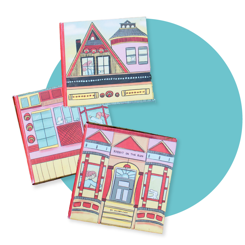
Rabbit on the RunBook Design

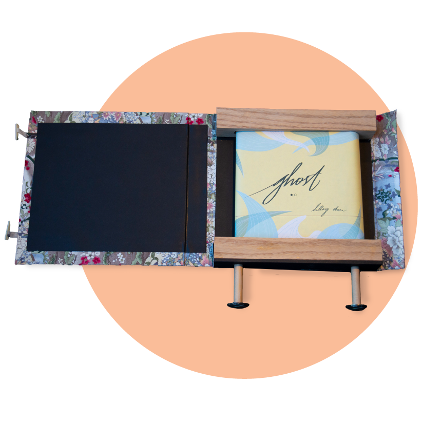
GhostPrint

Our Solar SystemAnimation

OverfishingPrint and Digital

Shopify - Work Through FailureIllustration

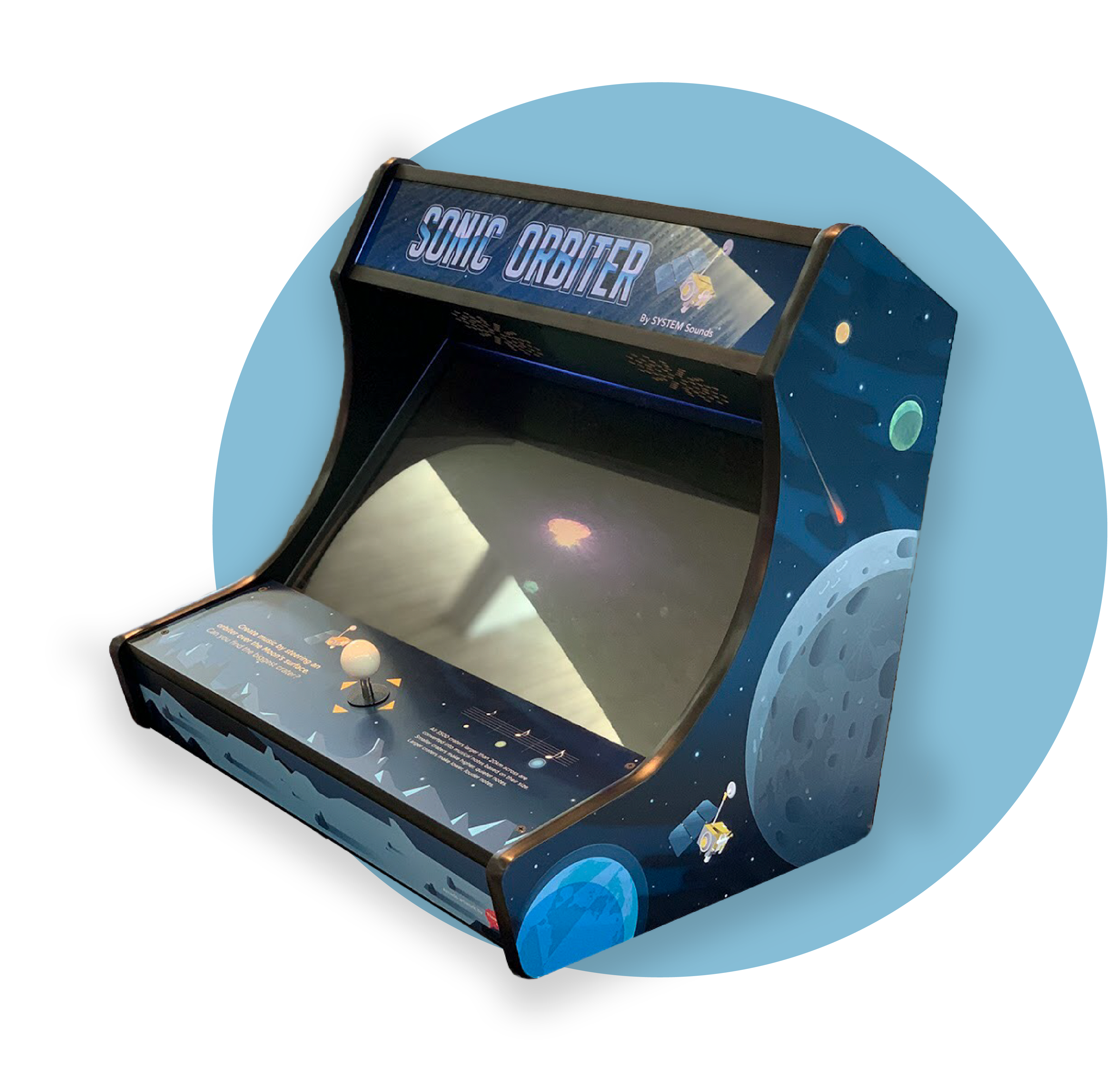
Sonic OrbiterPrint

Book Design - DuplicateBook Design
Say Hi!
Let's grab a coffee- feel free to email me at hmchen98@gmail.com.
Here's my resume!
© 2021 Hillary Chen


